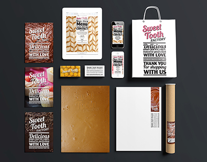

The Liberal Democrats underwent a rebrand in 2009, introducing a complimentary colour of teal to the yellow. The intention was to add some contrast to the yellow when in use. But the problem with this became apparent with the usage across the party’s numerous literature. Often the teal was the dominant colour. No restrictions were introduced that limited the usage of this secondary colour. You could argue It also gave some the impression that teal was introduced as an indication of the Conservative coalition. So as the first inhouse designer my task was to bring about changes to the brand and develop a guideline pack to ensure brand consistency was accomplished.

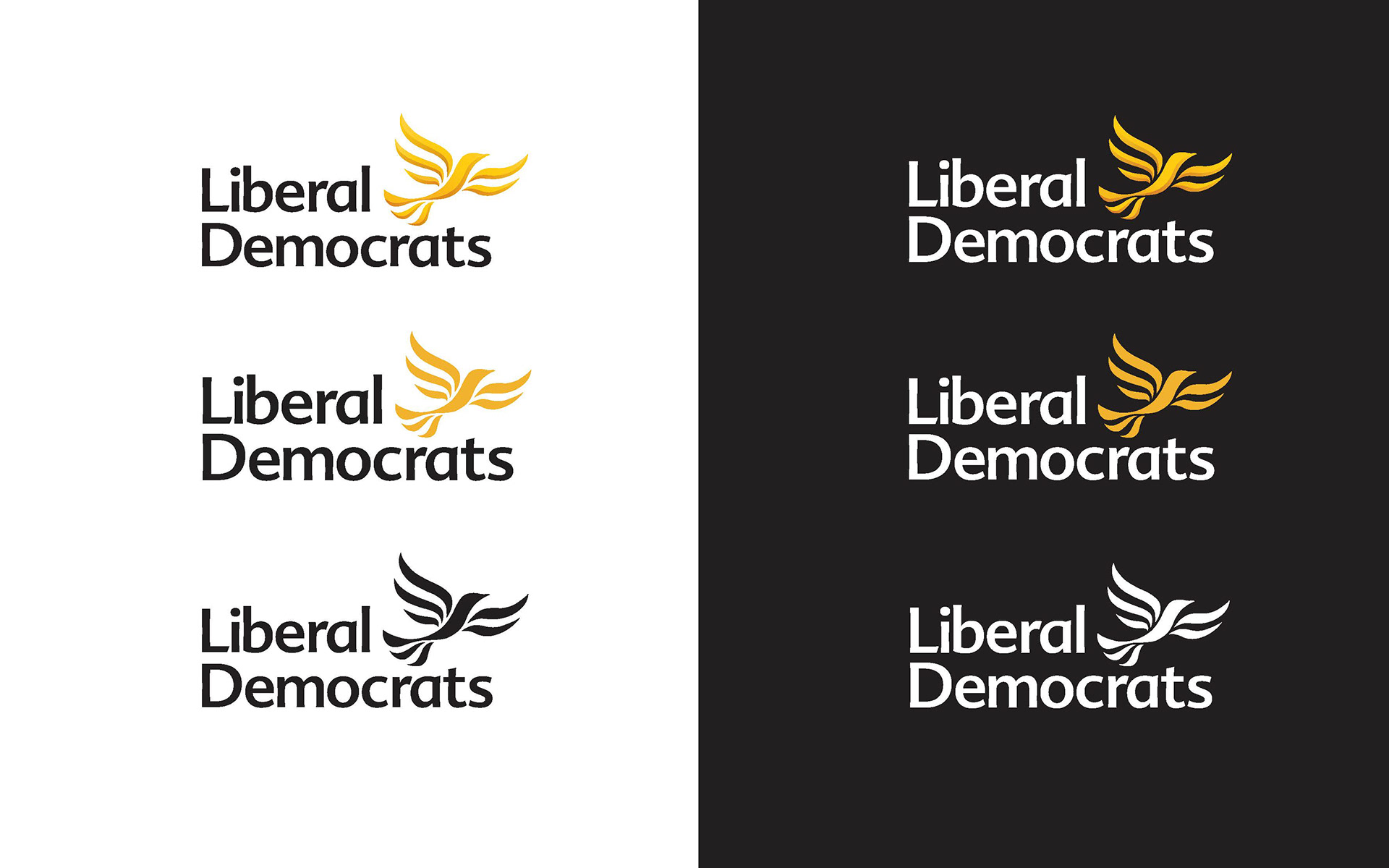
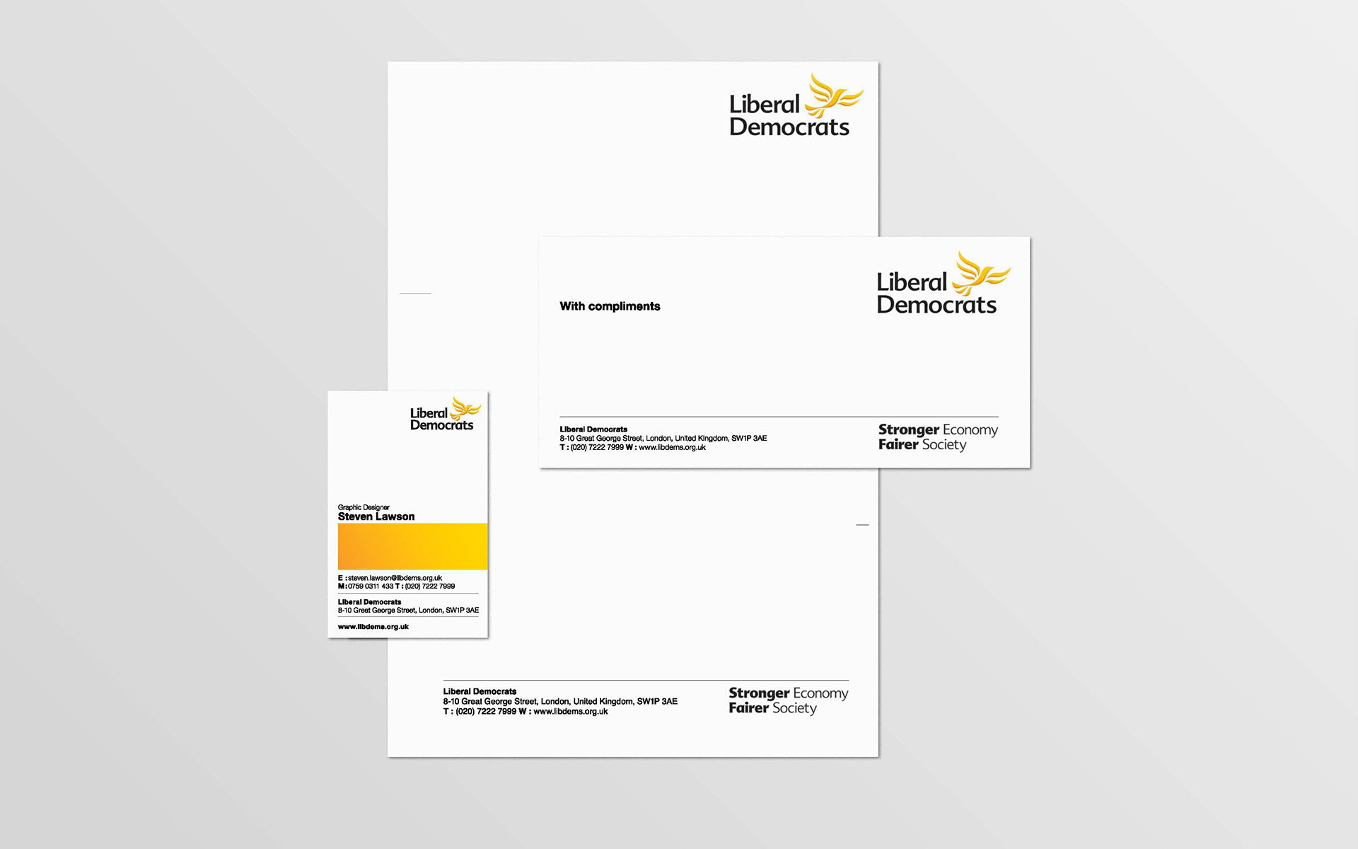
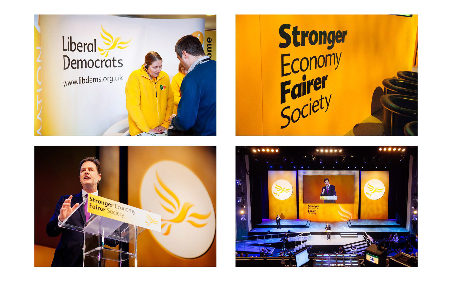
The bird icon was refined to fit in with some of the new brand assets (mainly the gradient block). The positioning has also changed in order to give the impression that the bird is setting off given the lockup a sense of energy and projection as opposed to flying in to perch on the wordmark like the old version.
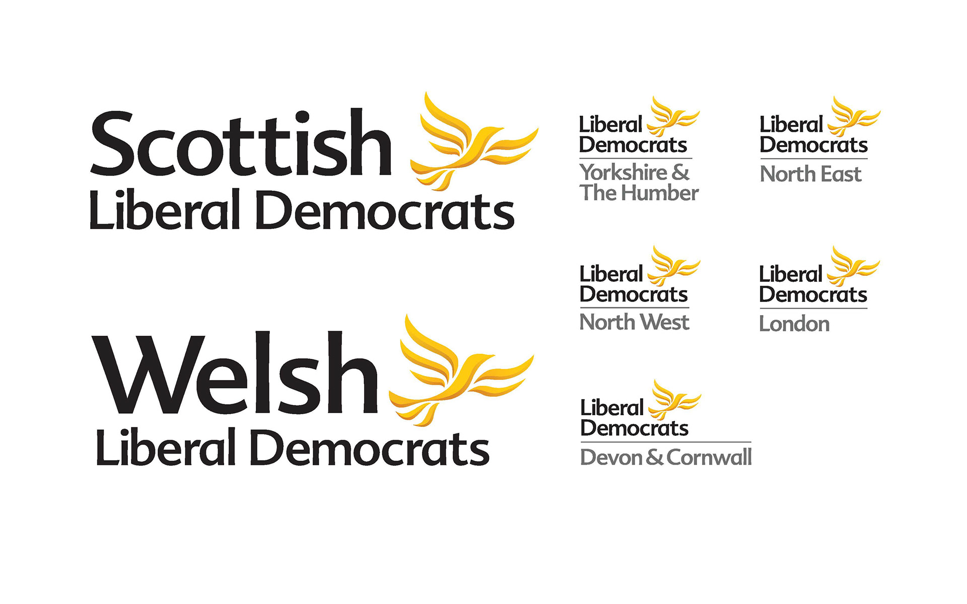
Throughout my research I discovered scores of different logo variations that existed for many groups/organisations affiliated with the Lib Dems. Thus it was important to manage this aspect. For the Scottish & Welsh Regional Parties I create a more bespoke lockup that is more akin to the main parties logo. And for the councils/groups a simple rule system was introduced that separated the main logo lockup. The result provides some much needed flexing on the logo whilst still retaining a good level of functionality for the logo to work across numerous digital and print platforms.
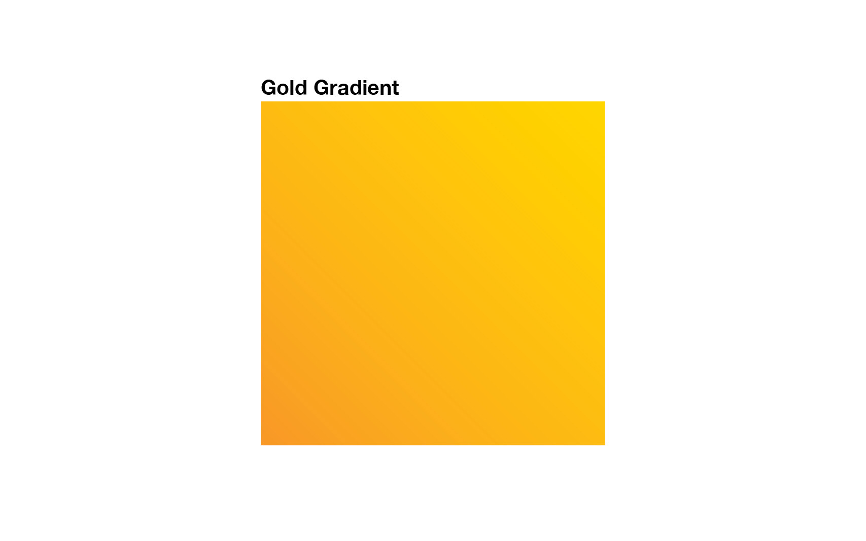
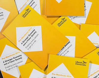
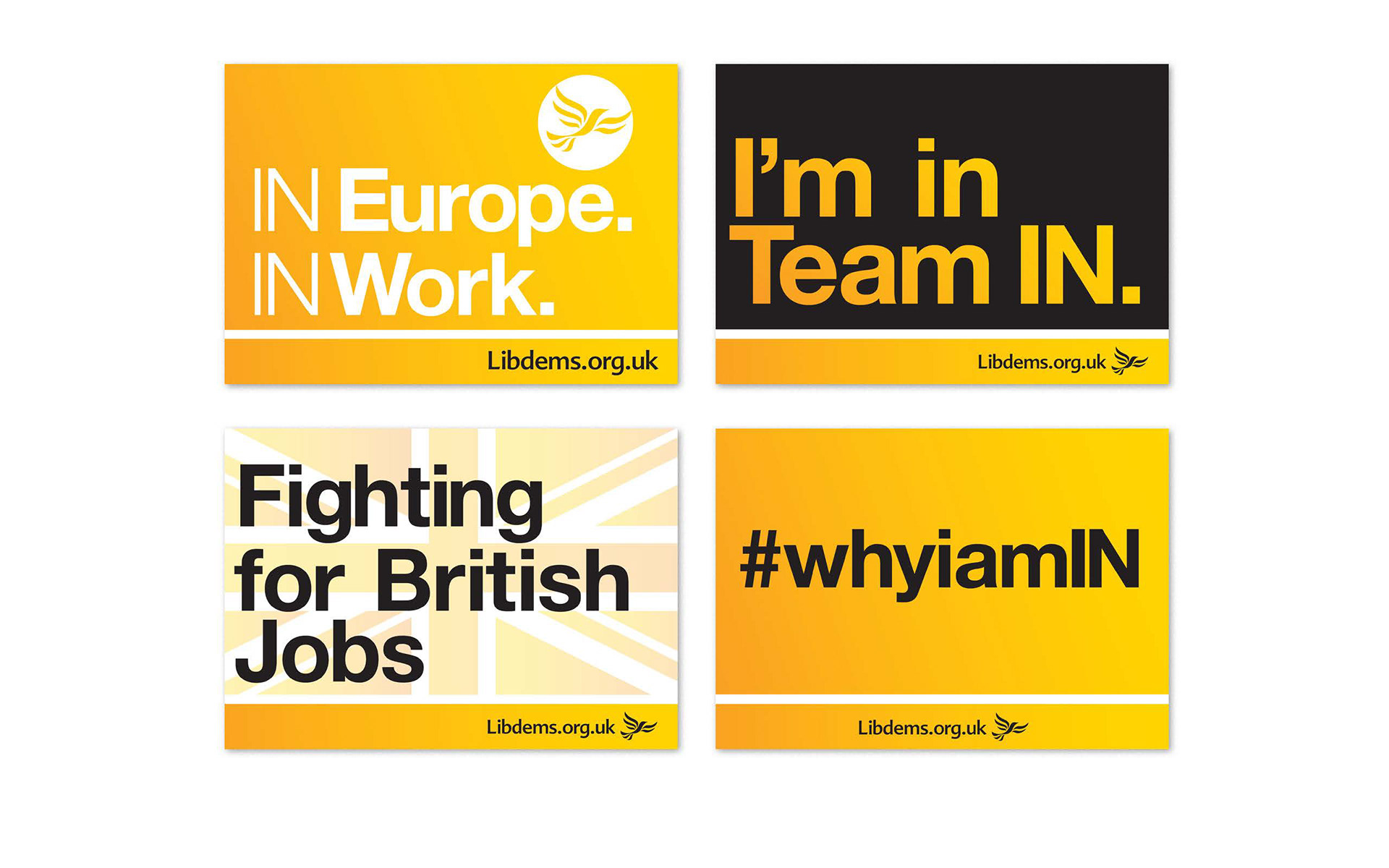
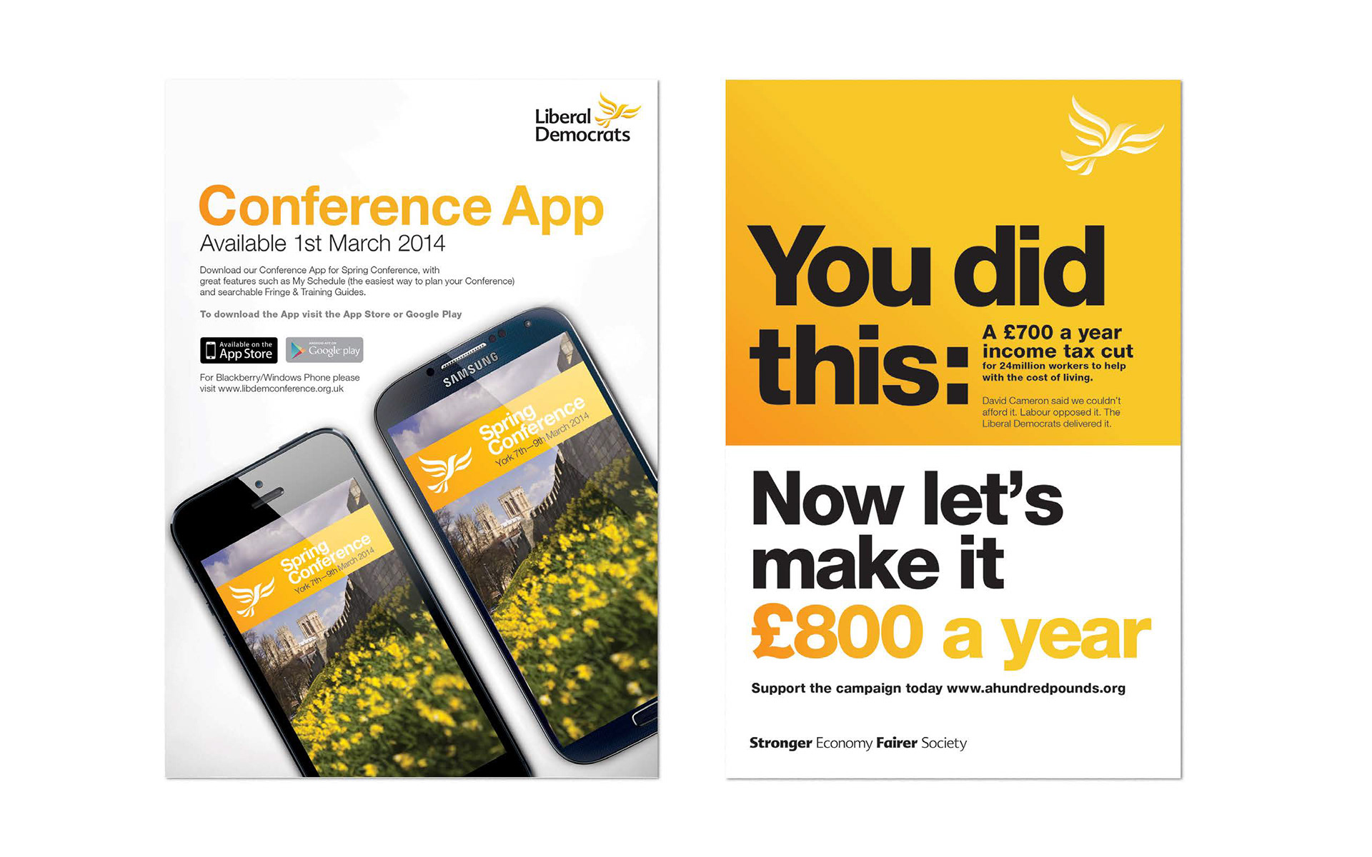
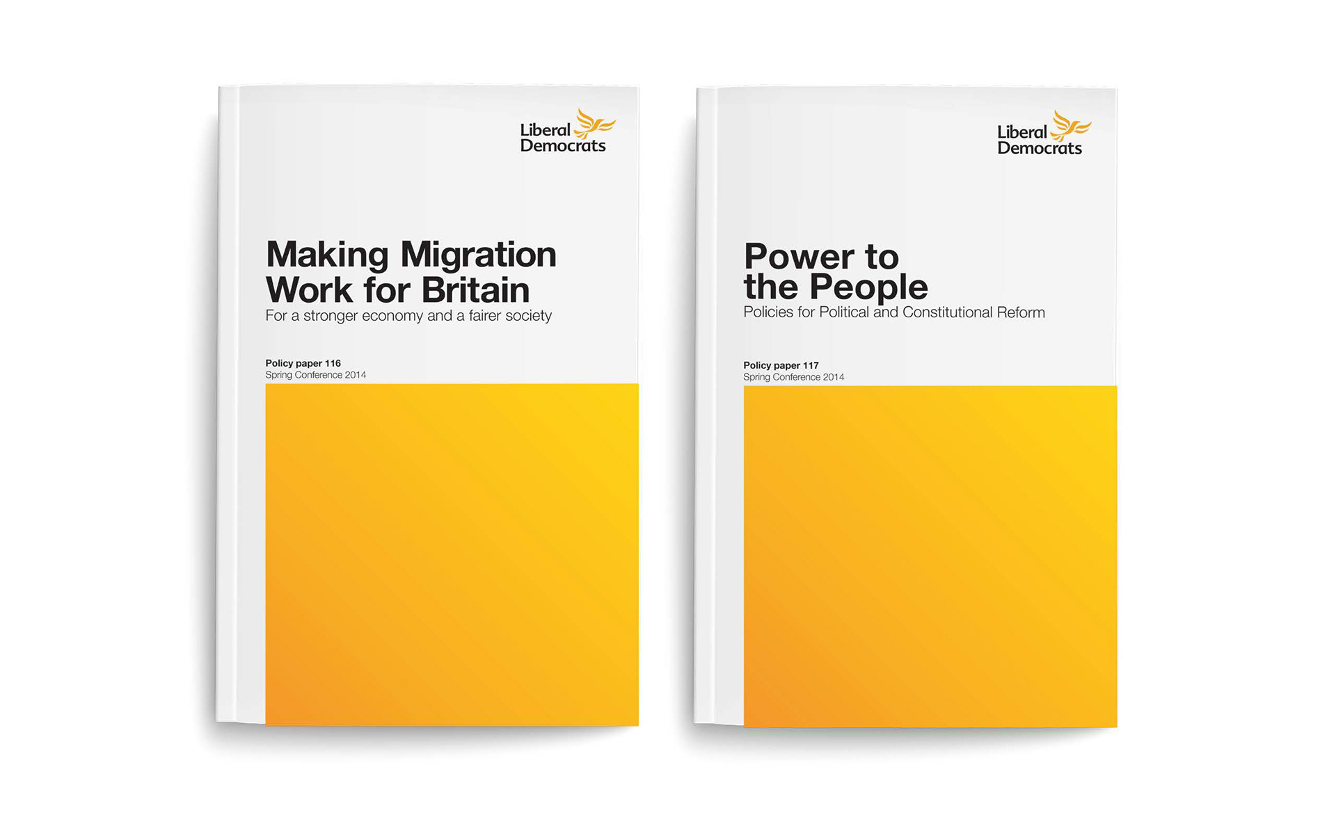
The Gold Gradient was introduced in order to tackle some of the irregular colour trends that develop from literature and the numerous ground campaigners (who were not trained designers) producing literature. Alongside this graphical element were guidelines on how this element could be used as device to break up space and to add some contrast to designs. The result is a flexible solid block with infinite composition arrangements that still nods to the brand identity.


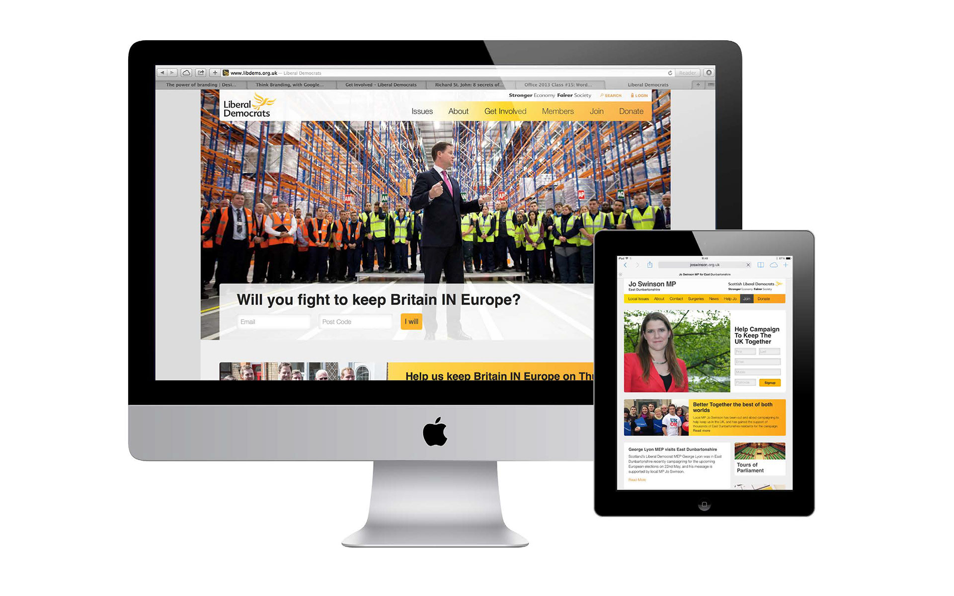

The identity update is a much needed return to the parties grass roots championing the yellow/gold and allowing this to be used in such a dynamic manner with the addition of the gold gradient block. But it also illustrates the benefits of having implemented a in house design team to manage visual outputs of the party.
The biggest takeaway has been the need to train staff about brand identity and it's importance. Changing a companies culture towards brand visuals is not an easy task. But I did this by creating presentations for stakeholders across various departments as well as presenting to some Special Advisers for MPs.